About

A premium system build with Penny at the center.

WildCard DEV is designed to feel like a high-end holographic interface: cinematic enough to be memorable, structured enough to stay dependable, and polished enough to carry a true flagship identity.

This phase keeps the rebuilt foundation intact and focuses on how the site feels in use. The contact lane becomes easier to understand, quicker to act on, and more polished under mouse, keyboard, and touch without introducing risky interaction patterns.

What changes in this phase

The biggest changes land in the contact experience: clearer action grouping, elevated Penny routing, stronger interactive language, and safer responsive behavior for high-intent actions like email, calling, texting, and profile visits.

Web Design

Premium layouts, polished framing, and brand-driven interfaces that feel deliberate instead of improvised.

Web Development

Stable self-contained architecture with clean single-file organization that remains easy to maintain and expand.
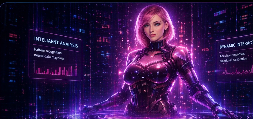
Assistant-Led UX

Penny is treated as part concierge, part executive interface, and part branded intelligence rather than a decorative add-on.

Brand Systems

Blue and violet establish the system. Penny’s signature pink marks the moments where the intelligence inside that system takes control.

Resume / Experience

Experience and execution, inside a cleaner flagship shell.

Matt Tobaben — Full Stack Developer / CEO

WildCard DEV leadership, frontend architecture, UX direction, branded systems thinking, and practical build execution across web and app experiences.

Current Focus

WildCard DEV 2024 — Current

Building the flagship company site, premium contact experience, responsive UX systems, and Penny-centered brand interactions.

Production-minded frontend work Ongoing

Prioritizing layouts that stay stable across desktop, phone, and very small screens before layering in higher-risk polish.

Why this section still matters

The earlier rebuild phases raised the brand presence without undoing the dependable foundation. Experience remains cleanly accessible so later collateral, QR links, and deeper resume presentation can be added without reopening layout problems.

Portfolio / Holo Stage

A restored holo panel system with cinematic energy and safer bones.

The portfolio lane remains intact from the previous rebuild and now benefits from the same cleaner interaction language used across the contact experience. The presentation stays layered, glassy, and system-consistent, but the motion model and layout remain intentionally restrained so desktop polish never comes at the expense of phone or watch-sized containment.

Tony Stark inspired / stability first

Portfolio / Holo Stage

Existing repo media is reused as the ambient energy source for the showcase, while the panel framing, HUD labeling, and controlled glow language bring the section back as a true flagship feature. Penny keeps her own pink-dominant panel so the assistant presence still reads as distinct from the broader system.

Core System Panel Panel 01

WildCard DEV flagship shell

Stable single-page architecture, fake-page navigation, and premium framing that gives the rest of the brand a dependable stage to stand on.

System glow / blue-violet Responsive-safe presentation
Flagship interface Panel 01

WildCard DEV core experience

The base shell now has a portfolio presentation worthy of the brand: glassy, illuminated, and controlled instead of looking like a temporary placeholder.

Service showcase Panel 02

Client-facing presentation lane

This panel language is built to sell premium capability: cinematic enough to impress, but calm enough to stay readable and dependable.

Penny signature panel Panel 03

Penny command intelligence

Pink remains the control signal. Penny’s panel feels higher-touch and more intimate than the base system panels, preserving her role as the heart of the brand.

Expansion route Panel 04

Watch, QR, and future utility flows

The restored stage gives future wearable demos and utility features a polished home instead of forcing them into a section that was never designed to carry them.

Stable presentation first

The holo system is stronger visually, but it still respects the same responsive guardrails established in earlier rebuild phases.

Brand-consistent glow language

Blue and violet define the main system panels, while Penny’s pink lane stays clearly separated anywhere her presence takes priority.

Safe interaction model

The spotlight control uses dependable click/focus switching rather than fragile hover-only behavior, and the grid remains readable even when stacked.

Contact / Penny Office

Penny now feels like the premium intelligence running the room.

Penny Office Executive Assistant Layer
Online WildCard System
Penny Presence

Controlled. Confident. Polished. A little dangerous in a perfectly professional way.

Penny is the premium assistant presence of WildCard DEV. She is not filler, not a gimmick, and not just a contact form skin. She is the interface voice that makes the system feel personal, high-end, and unmistakably alive.

Pink-forward identity Executive-assistant energy Stable on small screens
Role Front desk intelligence Guides contact, tone, and first impressions.
Signal Pink control layer Distinct from the base blue/violet system.
Client Intake

Clear first-contact routing for proposals, builds, rescue work, and premium branded experiences without making visitors hunt for the right lane.

Fast Response Paths

Phone, text, and email all stay visible and tappable, with stronger feedback so the site feels intentional instead of passive.

Brand Tone Control

Penny’s lane stays elevated, pink-forward, and controlled so the contact experience feels polished rather than generic.

Penny’s office now emphasizes decision clarity: the fastest route, the cleanest written route, and the future utility route are all visible immediately, while the interaction layer stays safe, lightweight, and mobile-friendly.

Contact WildCard DEV

Choose the lane that fits how you like to move. Email handles fuller project detail, text keeps things quick, and the direct line stays visible when speed matters.

Matt Tobaben Primary build lane
matt@wildcarddev.com (402) 915-0789
CEO Full Stack Development Project Intake
Space Beth Smith Partner lane
SpaceBeth@wildcarddev.com Partner / developer / collaborative build force
Partner Development
Company line Fastest response lane
(402) 915-0789 Primary direct contact for current site, app, and rescue-build inquiries.
On phones, every primary contact control remains thumb-friendly and visible without requiring hover.
Penny’s pink lane highlights priority actions, while the rest of the system keeps the blue/violet WildCard DEV framing intact.

Leave a message for Penny

Send the polished version here. This keeps the current contact flow dependable while making the intake experience feel more like a premium concierge handoff than a generic form.

Email, phone, text, and form pathways all stay live here, but this lane is tuned for the cleanest handoff when you want to explain exactly what you need.

Watch Experience

The watch lane stays in place for the later Penny utility build.

This section remains intentionally lightweight, but the structure is still preserved so later QR sequences, watch-specific layouts, and Penny-driven utility flows have a stable place to land.

Why it stays now

Keeping the watch lane visible preserves continuity, navigation, and future implementation space.

What returns later

QR sequences, Penny-triggered flows, wearable contact utilities, and stronger media integration once the current core is fully locked.

What this rebuild adds indirectly

A restored holo language the future watch experience can borrow from, so wearable flows feel like part of the same premium system instead of a disconnected add-on.